For our final project for IXD102, he assigned us a design history essay webpage which would not only entail taking all of research methods we have used for Kyle’s class for our design presentation and type specimen screen but also, take the work we were currently doing in Paul’s class about HTML and CSS to create a fully functioning webpage, which is full of colour, images, a range of typography and more. This would be the most challenging project we had to do for both classes because we were taking elements of both classes and combing them to create an interactive webpage, which I had done before however, I didn’t use code to create it and for this project we relied on code. Kyle began explaining the objective of this project and that we would be focusing on a chosen designer from a list he had provided for us and we would create an essay on a question of our choosing from our chosen designer. The essay had to be 1,500 words and needed to have referencing throughout. I had no issue with this as I love essay writing and literature is one of my favourite hobbies so I was looking forward to starting this project until, Kyle explained we would be creating the website completely out of code, which we were learning how to do in Paul’s class. I have previously created websites and had no real issue before however, these were using design-front software so there was no code involved however, in Paul’s class we were only focusing on code and how to write it. I knew what HTML and CSS was before begins Paul’s class but now we were actually using it and creating a website and it was clear to see that I was definitely struggling with it as I never enjoyed writing code and this project relied on it and I was definitely worrying about how it would come out. Even though I knew writing the code would be a struggle I put it away to one side and began this project by focusing on my chosen designer and the essay.
Choosing a Designer
I started my research by looking at the list of designers that Kyle had given us and their work. I was looking mostly at their work and if it stood out to me for example if they had done work that I would see everyday like brands or icons that are universally used, and while I worked my way through this list I came out with three designers that I really liked and whose work was eye-catching and that I liked and theses were: Saul Bass, Jessica Hische and Kyle Teak. After a closer look into each designer and understanding their style and work, I was really interested in Saul Basses work because of his work within the film industry and his amazing work in designer posters and in some cases title sequences. I have been a lover of films since I was young and seeing some of the posters he created for some of the most iconic films like ‘The Shinning’ and the title sequence for ‘Psycho’ reminded me of how these thrillers got me into not just film but more specifically the horror and thriller genre since I was young and I knew then that I wanted to focus on Saul Bass and his work. The next step in this project was to create a question that I would base my essay on so I continued by doing further research on Saul Bass and his work and even though he has done amazing work in designing logos for popular brands such as 'Quaker Oats’ and ‘Kleenex’ I wanted to focus more specifically at his work in film industry. He created amazing poster designs for the films such as ‘West Side Story’ which is still used today and even remakes of the movie have created new posters for it but have used the same concept seen in the original design such as ladders, railings and two people together. Although, I was really interested in his work in the horror and thriller genre and saw that he done work for films such as ‘Bunny Lake is missing’ and his designs was hauntingly captivating and invoked feelings of curiosity, apprehension and fear. With the knowledge of wanting to have my essay based on Saul Basses work with horror and thriller films I began creating lists of questions that I could use and noting them all down, even if I knew I wouldn’t use them, it was still good to have them written out for future inspiration. After a lot of deliberation I finally chose my question which was “How did Saul Bass influence the film industry, especially within the horror and thriller genres?”
Planning my Essay
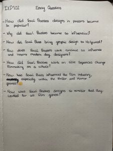
I then started to work on my essay and began by creating a plan for the essay and how I would lay it out. I of course needed a introduction into who Saul Bass was and why he is so famous and give a quick overview to the reader about what we would be looking at in this website essay. Next I wanted to talk about his work in the horror and thriller genres, about his use of colour and type, the nihilistic style he uses and how it still invokes a lot of feeling for the audience and some of his most infamous pieces of work within these genres. Next I covered his influence on modern horror and thrillers, looking closing at how his strong use of colours within posters are used especially within the horror genre as well as how he completely revolutionised title sequences and gave them meaning within a film. Following on, I wanted to give an in-depth look at Basses work on posters as that is what he known for and how effective they are in captivating the audiences attention and how even nowadays, modern filmmakers try and recreate his work in hopes of having such positive effects on their posters like Basses did. For my final paragraph I wanted to finish by looking at his work in title sequences so both of his work which is famous in the horror and thriller film industry, got a in-depth look at how and why they became so effective. After I had finished my essay plan, I then done an extensive amount of research into each section about what examples I could include, fishing through loads of websites as well as books to get perfect citations to include which would be great talking points too for my essay. After I felt like I had enough research done I began writing my essay and this took quite a bit of time, which was mainly spent by perfecting it. Reading it over and over again, making sure my points made sense and that my citations worked perfectly throughout my paragraphs and that they didn’t stick out like a sore thumb. I finally had a completed essay which I was happy about and Kyle read over my finished product and he too was pleased with my work and so here is my finished essay on Saul Bass.
How has Saul Bass influenced the film industry, especially within the thriller and horror genres?
Introduction
To discuss the ground-breaking and influential work of Saul Bass we need to understand who he is, so to begin, Saul Bass is an American filmmaker and graphic designer who was born in New York in 1920. As a child he drew constantly and as he grew his passion for design continued and he began learning under the guidance of György Kepes who was a master of the Bauhaus aesthetic. He became recognised for his work on the film poster Carmen Jones in 1940 and it was so impressive that the filmmakers asked him to create a title sequence for it too and this was the steppingstone of his career. Basses wanted to add a new level of sophistication to movie posters and to do so he used his minimal style alongside bright and eye-catching colours. Due his movie posters becoming so successful and effective this allowed for his creativity to flow onto title sequences. Sequences had been mostly overlooked by filmmakers, but Bass had other ideas and wanted his title sequences to convey “the essence of a movie and prepared audiences for what they were about to see.” (Britannica, 2019)
Thrillers and Horrors
As a lover of horror and thrillers I was extremely intrigued when I saw that a lot of Basses work was of psychological thrillers such as Psycho, Vertigo, Bunny Lake is missing and The Shinning. Films such as The Shinning were what sparked my interest in the horror and thriller genre, and it was interesting to research the work of Bass with his simple style of using symbolism, geometric shapes and sometimes a single image to create a focal point on the poster to express a powerful message. His eye-catching work caught the attention of Otto Preminger, a director who was creating ‘The Man with the Golden Arm’ and had Bass create the poster as well as the title sequence of the film. It was extremely well received by audiences, and he went on to create more posters and sequences for Preminger as well as Stanley Kubrick in which he created the iconic Shinning poster and the notorious “Master of Suspense”, Alfred Hitchcock. Bass created memorable as well as effective title sequences for Hitchcock such as Psycho and Vertigo. These cult classic films are iconic due to their effective suspense and with Bass’s title sequences this sets the perfect tone for the film with the effectiveness deriving from his choppy and quick pace editing, it has the audience on edge immediately. It was even said that Bass helped direct, arguably one of the most iconic movie scenes of all time, Psycho’s shower scene. The quick pace and jumping from angle-to-angle to create suspense is very similar to Bass’s work. It is easy to imagine that Bass had some input when it came to this scene. In conjunction with this, “Bass changed the common practise in Hollywood, as the effect of good design on a film’s success became apparent” (Eskilson, 2019) Basses use of bright colours and basic shapes to help express complicated and conflicting emotions, for example he was able to convey tones of apprehension through his movie posters such as The Shinning and Bunny Lakes is missing. He stripped the design right back to simple geometric shapes and in nearly all posters limited himself to three colours: black, white and a colour of his choosing. ‘The Shinning’ poster only consists of two which are yellow and black which symbolises danger and brings back that feeling of apprehension and worry. The ‘Bunny Lakes is missing’ poster only has black, white, and red throughout the whole poster and with the simple imagery of what looks to be an outline of a little girl it invokes an uneasy feeling. It resembles a missing child ad on a newspaper and the worry you feel if you were in that situation and the uneasiness that comes with the thought that something bad has happened to that child.
Influence on Modern Horrors and Thrillers
Basses work reaches across all genres from romances such as ‘The Man with the Golden Arm’ to musicals such as ‘West Side Story’ and even to thrillers such as ‘Vertigo’. His minimalistic style helped convey the emotions of the story and “helped film titles become an integral part of the story and ultimately the whole cinematic experience” (Jotform,2020) which was revolutionary as title sequences were seen as boring and unimportant legalities however Bass wanted to change that and was able to create suspenseful and eerie atmospheres with his minimalistic title sequences. Not only did his title sequences express the theme of the movie but his posters did as well with the use of bold colours and unsettling imagery examples of this can be seen within the “The Shinning” poster, and it was Basses belief that “title sequences were responsible for setting the mental and emotional tone for the story that was about to be told.”(Wired,2016) I feel like this is extremely true in title sequences and posters in the horror and thriller genre and with Basses inspiring and revolutionary work it completely changed these two genres.
Looking firstly at how Basses work has influenced the horror and thriller genres in terms of posters his minimalistic style with the use of shapes and bright colours are great attention-grabbers. It was said that “Bass interpreted the nature of film in simple graphic terms, making his posters instantly recognisable and striking” (Horak, 2014) and you can see why filmmakers still try to recreate his work to draw in the audience attention like Basses work has done. Basses work is so recognisable with his use of simple geometric shapes and bright colours especially in horror and thriller posters which is ironic as bright colours don’t seem right to use when trying to create a dark and suspense tone for a horror/thriller films. However, using bright colours such as red and yellow invoke the feelings of danger and uneasiness as colours such as these symbolise blood and danger and it is perfect for horror and thrillers. The use of basic shapes as well allow for viewers imagination to run wild as it lets people have their own perception on what they are viewing, and it adds to the idea that things are not always as they seem with hidden imagery. The simplicity of basic shapes also adds a sense of uneasiness to the poster as it shows how less is more and this is very true for horror and thriller films as sometimes an overcomplicated plot can completely ruin a film. A great example of Basses influence on horror and thriller posters is the poster showcasing the film ‘Suspiria’, an Italian horror created by the iconic Dario Argento, the poster is extremely simplistic with using of only three colours, white, black, and red, which symbolises danger and death and sets an eerie tone for the film. The only imagery used is a ballerina with blood gushing from her across the poster and the idea of something so gentle and fragile like a ballerina covered in blood is very unsettling but is perfectly executed because of Basses influence.
Now if we look at Basses influence over title sequences, we see that his impact has been huge as before title sequences were just annoying legalities but now, they are what sets the tone for the film, and he was able to bring life to them and make them an important part of every film. Basses title sequences have been described as “hypnotic, kinetic, dynamic assemblages – often teamed with edgy, contemporary scores - that came to define “modern” filmmaking in all its restless energy” (GQ-Magazine, 2020) and many filmmakers wanted to incorporate Basses style within their title sequences as it was the perfect way to set the tone for a film especially for horrors and thrillers. Some of Basses most iconic title sequences include Psycho and Vertigo as the use of simple designs from lines to spirals create an almost hypnotic atmosphere and it immediately catches the audience’s attention and helps sets a suspenseful tone for the films. Using the title sequence as a prelude was Basses idea and was the first-time title sequences were seen as an important characteristic of any film and now with every film, the title sequence is created with such importance as filmmakers want to create the perfect atmosphere for their film. Looking at modern horror and thriller films you can see a lot of time has went into the title sequences and in some of them Basses style is used to create an eerie and suspenseful tone such as ‘A Nightmare on Elm Street (2010)’ where the title sequence is made up with short clips and quick editing to make it seem as though you are flicking through these clips in a fast pace and this choppy editing is often associated with Basses style as the quick pace emphasised the sinister tone that was being created. In this film the quick editing mixed with the dark colours used create that dark and suspenseful tone which is contrasted by the clips of children playing and giggling however, since these clips are slowed and placed in with the choppy editing it creates an extremely sinister tone and that was what the filmmakers were aiming for. It is a perfectly executed title sequence and it was heavily influenced by Saul Basses style.
Bibliography:
Creating my Website
This was the part I was dreading for the project, not so much designing the website but more writing all the code for it and I knew I would struggle with it and oh how right I was. I had an initial sketch of what my website would look like however, once I started creating I found that I didn’t like the placement of the navigation bar so I decided to switch it back to the top of the page.